Class RadioButton
Enables the user to select a single option from a group of choices when paired with other RadioButton controls.
[ControlCategory("Common")]
public class RadioButton : ButtonBase, IBaseObjectWithAttr, IBaseObjectWithId, INotifyPropertyChanged, IDisposableObject, IBaseObject, ISupportInitialize, IFocusable, ITextProperty, IComponent, IControl, IDisposable, IWin32Window, ILayoutItem, INotifyDataErrorInfo, ICommandSource- Inheritance
-
RadioButton
- Implements
Examples
Here is how to declare a RadioButton in UIXML:
<RadioButton Name="radioButton1" Margin="8" Text="Option 1.1" CheckedChanged="RadioButton_CheckedChanged" />
<RadioButton Name="radioButton2" Margin="8" Text="Option 1.2" CheckedChanged="RadioButton_CheckedChanged" />
<RadioButton Name="radioButton3" Margin="8" Text="Option 1.3" CheckedChanged="RadioButton_CheckedChanged" />
And the corresponding event handler in the code-behind:
private static void RadioButton_CheckedChanged(object? sender, EventArgs e)
{
    if (sender is not Alternet.UI.RadioButton radioButton)
        return;
    var text = radioButton.IsChecked.ToString();
    MessageBox.Show(text, string.Empty);
}
Also, a RadioButton can be created from code:
var panel2 = new StackPanel { Orientation = StackPanelOrientation.Vertical, Margin = new Thickness(5) };

panel2.Children.Add(new Alternet.UI.RadioButton() { Text = "Option 1.1", Margin = new Thickness(0, 0, 0, 5) });
panel2.Children.Add(new Alternet.UI.RadioButton() { Text = "Option 1.2", Margin = new Thickness(0, 0, 0, 5) });
panel2.Children.Add(new Alternet.UI.RadioButton() { Text = "Option 1.3", Margin = new Thickness(0, 0, 0, 5) });
Remarks
When the user selects one radio button (also known as an option button) within a group, the others clear automatically. All RadioButton controls in a given container, such as a Window, constitute a group. To create multiple groups on one window, place each group in its own container, such as a GroupBox.
RadioButton and CheckBox controls have a similar function: they offer choices a user can select or clear.
The difference is that multiple CheckBox controls can be selected at the same time, but option buttons are mutually exclusive.
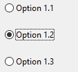
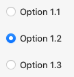
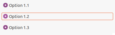
Examples of how a RadioButton can look on different platforms:
Set Text property to specify the text displayed on the control.
A RadioButton, like any other Control, can be disabled by setting its Enabled property to false.
Constructors
- RadioButton()
Initializes a new instance of the RadioButton class.
- RadioButton(AbstractControl)
Initializes a new instance of the RadioButton class.
Properties
- ControlKind
Returns control identifier.
- Handler
Gets a IRadioButtonHandler associated with this class.
- IsChecked
Gets or sets a value indicating whether the control is checked.
Methods
- CreateHandler()
Creates a handler for the control.
- OnCheckedChanged(EventArgs)
Called when the value of the IsChecked property changes.
- RaiseCheckedChanged()
Raises the CheckedChanged event and calls OnCheckedChanged(EventArgs).
- RaiseSiblingsCheckedChanged()
Calls RaiseCheckedChanged() for all sibling RadioButton controls.
- SetChecked(bool)
Sets the value of the IsChecked property.
Events
- CheckedChanged
Occurs when the value of the IsChecked property changes.