Class CheckBox
Represents a check box control.
[ControlCategory("Common")]
public class CheckBox : ButtonBase, IBaseObjectWithAttr, IBaseObjectWithId, INotifyPropertyChanged, IDisposableObject, IBaseObject, ISupportInitialize, IFocusable, ITextProperty, IComponent, IControl, IDisposable, IWin32Window, ILayoutItem, INotifyDataErrorInfo, ICommandSource- Inheritance
-
CheckBox
- Implements
Examples
Here is how to declare a CheckBox in UIXML:
<CheckBox Text="ListPicker is enabled" Name="isEnabledCheckBox" IsChecked="True" Margin="8" CheckedChanged="IsEnabledCheckBox_CheckedChanged"/>
And the corresponding event handler in the code-behind:
private void IsEnabledCheckBox_CheckedChanged(object? sender, EventArgs e)
{
    comboBox.IsEnabled = isEnabledCheckBox.IsChecked;
}
Also, a CheckBox can be created from code:
var checkBox = new Alternet.UI.CheckBox()
{
    Text = "Option 1.1",
    Margin = new Thickness(0, 0, 0, 5),
};
return checkBox;
Remarks
Use a CheckBox to give the user an option, such as true/false or yes/no. The CheckBox control can display an image or text, or both. CheckBox and RadioButton controls have a similar function: they allow the user to choose from a list of options. CheckBox controls let the user pick a combination of options. In contrast, RadioButton controls allow a user to choose from mutually exclusive options.
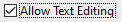
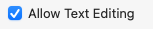
Examples of how a CheckBox can look on different platforms:

Set Text property to specify the text displayed on the control.
A CheckBox, like any other Control, can be disabled by setting its Enabled property to false.
Constructors
- CheckBox()
Initializes a new instance of the CheckBox class.
- CheckBox(AbstractControl)
Initializes a new instance of the CheckBox class.
- CheckBox(string)
Initializes a new instance of the CheckBox class with the specified text.
Properties
- AlignRight
Gets or sets whether to align check box on the right side of the text.
- AllowAllStatesForUser
Gets or sets whether user can set the checkbox to the third state by clicking.
- CheckState
Gets or sets the state of the CheckBox.
- ControlKind
Returns control identifier.
- Handler
Gets a ICheckBoxHandler associated with this class.
- ThreeState
Gets or sets a value indicating whether the CheckBox will allow three check states rather than two.
Methods
- BindBoolProp(object, string)
Binds property specified with
instanceandpropNameto the CheckBox. After binding CheckBox will edit the specified property.
- CreateHandler()
Creates a handler for the control.
- OnCheckedChanged(EventArgs)
Called when the value of the IsChecked property changes.
- RaiseCheckedChanged()
Raises the CheckedChanged event and calls OnCheckedChanged(EventArgs).
- SetChecked(bool)
Sets the value of the IsChecked property.
Events
- CheckedChanged
Occurs when the value of the IsChecked property changes.