Class RichToolTip
Allows to show a tool tip with more customizations than a standard tooltip. Additionally to the tooltip message RichToolTip allows to specify title, image and other options.
[ControlCategory("Other")]
public class RichToolTip : ScrollViewer, IBaseObjectWithAttr, IBaseObjectWithId, INotifyPropertyChanged, IDisposableObject, IBaseObject, ISupportInitialize, IFocusable, ITextProperty, IComponent, IControl, IDisposable, IWin32Window, ILayoutItem, INotifyDataErrorInfo, IRichToolTip, IToolTipProvider- Inheritance
-
RichToolTip
- Implements
Examples
Also, a RichToolTip can be created from code:
public void ShowToolTip_Click(object? sender, EventArgs e)
{
    tooltip.ShowToolTip(
        "Title",
        "Some text",
        MessageBoxIcon.Information);
}

public void HideToolTip_Click(object? sender, EventArgs e)
{
    tooltip.HideToolTip();
}

public void ShowToolTip2_Click(object? sender, EventArgs e)
{
    tooltip.Title = "Another Title";
    tooltip.Text = "Some text";
    tooltip.SetIcon(MessageBoxIcon.Error);
    tooltip.SetToolTipBackgroundColor(Color.Red);
    tooltip.SetToolTipForegroundColor(Color.White);
    tooltip.SetTitleFont(Control.DefaultFont.Larger().AsBold);
    tooltip.SetTitleForegroundColor(Color.White);
    tooltip.ShowToolTip();
}
Remarks
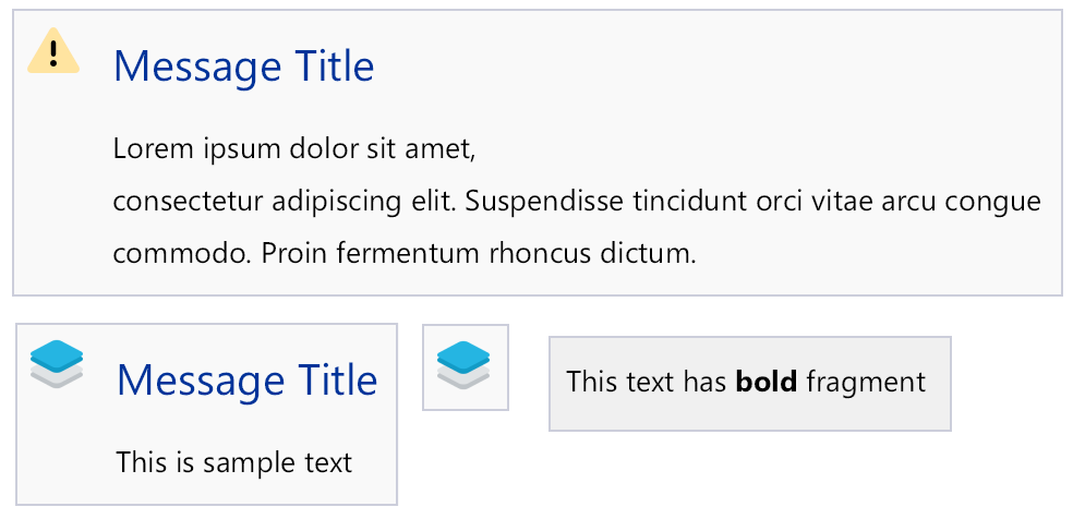
Example of how a RichToolTip can look:
Constructors
- RichToolTip()
Initializes a new instance of the RichToolTip class.
Fields
- DefaultImageMargin
Gets or sets default image margin in device-independent units.
- DefaultMaxWidth
Gets or sets default max text width of the tooltip.
- DefaultMessageMargin
Gets or sets default text margin in device-independent units.
- DefaultMinImageSize
Gets or sets default value for the tooltip minimal image size (in device-independent units). This is used for svg image size when standard MessageBoxIcon images are shown.
- DefaultTitleMargin
Gets or sets default title margin in device-independent units.
- DefaultToolTipBorderColor
Gets or sets default tooltip border color. This is used when DefaultToolTipBorder is created.
- ImageToTextDistance
Gets or sets default distance between image and title in device-independent units.
Properties
- DefaultToolTipBackgroundColor
Gets or sets default background color of the tooltip.
- DefaultToolTipBorder
Gets or sets default tooltip border.
- DefaultToolTipForegroundColor
Gets or sets default foreground color of the tooltip.
- DefaultToolTipTitleForegroundColor
Gets or sets default foreground color of the tooltip.
- IsCustomToolTipBorderSpecified
Gets whether custom tooltip border is specified.
- RealDefaultToolTipBorder
Gets real default tooltip border. This property returns Default if DefaultToolTipBorderColor and DefaultToolTipBorder are not specified.
- ShowDebugRectangleAtCenter
Gets or sets whether to draw point at center under the debug environment.
- ShowDelayInMilliseconds
Gets tooltip show delay in milliseconds.
- TimeoutInMilliseconds
Gets tooltip show timeout in milliseconds. If null, DefaultToolTipTimeout is used.
- ToolTipAlignment
Gets or sets vertical and horizontal alignment of the tooltip inside the container.
- ToolTipBackgroundBrush
Gets tooltip background brush.
- ToolTipBackgroundColor
Gets tooltip background color.
- ToolTipBorder
Gets tooltip border.
- ToolTipForegroundColor
Gets tooltip foreground color.
- ToolTipHorizontalAlignment
Gets or sets horizontal alignment of the tooltip inside the container.
- ToolTipIcon
Gets Tooltip icon.
- ToolTipImage
Gets Tooltip image.
- ToolTipLocation
Gets or sets tooltip location inside in client coordinated of this control. This value is measured in device-independent units.
- ToolTipTemplate
Gets template control used to layout tooltip elements.
- ToolTipTitleFont
Gets font of the tooltip title.
- ToolTipTitleForegroundColor
Gets foreground color of the tooltip title.
- ToolTipVerticalAlignment
Gets or sets vertical alignment of the tooltip inside the container.
- ToolTipVisible
Gets or sets whether tooltip is visible.
Methods
- CreateToolTipImage()
Creates an image filled with tooltip data (icon, title, message, border, etc.).
- CreateToolTipImage(RichToolTipTemplate, RichToolTipParams)
Creates an image representation of a rich tooltip based on the specified template and parameters.
- DefaultPaint(PaintEventArgs)
Default painting method of the UserControl and its descendants.
- DefaultPaintDebug(PaintEventArgs)
Provides default debug related painting behavior for the control when the application is compiled in debug mode.
- DisposeManaged()
Override to dispose managed resources. Here we dispose all used object references.
- GetPreferredSize(PreferredSizeContext)
Retrieves the size of a rectangular area into which a control can be fitted, in device-independent units.
- HideToolTip()
Hides tooltip.
- OnScroll(ScrollEventArgs)
Called when Scroll event is raised.
- OnSizeChanged(EventArgs)
Called when the SizeChanged event.
- OnSystemColorsChanged(EventArgs)
Called when the SystemColorsChanged event is raised.
- OnTextChanged(EventArgs)
Called when the TextChanged event is raised.
- OnTitleChanged(EventArgs)
Called when the value of the Title property changes.
- OnlyImage(ImageSet?)
Sets tooltip to show only the specified image.
- RaiseToolTipVisibleChanged(EventArgs)
Raises ToolTipVisibleChanged event.
- ResetText()
Sets text to an empty string.
- ResetTimeout()
Resets TimeoutInMilliseconds and ShowDelayInMilliseconds to the default values.
- ResetTitle()
Sets title to an empty string.
- ResetToolTipColors()
Resets all tooltip color properties to the default values.
- SetIcon(ImageSet?)
Sets the small icon to show in the tooltip.
- SetIcon(MessageBoxIcon?)
Sets the standard icon to show in the tooltip.
- SetTimeout(uint?, uint)
Sets timeout after which the tooltip should disappear, in milliseconds. If 0 is specified, tooltip will not be hidden automatically. Optionally specify a show delay.
- SetTitleFont(Font?)
Sets the title text font.
- SetTitleForegroundColor(Color?)
Sets foreground color of the tooltip title.
- SetToolTip(object, bool)
Sets simple tooltip contents.
- SetToolTip(object?, object?, MessageBoxIcon?, uint?)
Sets tooltip contents.
- SetToolTipBackgroundBrush(Brush?)
Sets tooltip background brush.
- SetToolTipBackgroundColor(Color?)
Sets tooltip background color.
- SetToolTipForegroundColor(Color?)
Sets foreground color of the tooltip message.
- SetToolTipFromTemplate(TemplateControl, Color?)
Sets tooltip with contents filled from the template data.
- ShowToolTip(PointD?)
Shows the tooltip at the specified location inside the. Location coordinates are in device-independent units.
- ShowToolTip(object, bool, PointD?)
Shows simple tooltip on the screen.
- ShowToolTip(object?, object?, MessageBoxIcon?, uint?, PointD?)
Shows tooltip on the screen.
- ShowToolTipFromTemplate(TemplateControl, Color?, PointD?)
Shows tooltip with contents filled from the template data.
- ShowToolTipWithError(object?, Exception, uint?, PointD?)
Shows tooltip with error on the screen.
Events
- ToolTipVisibleChanged
Occurs when ToolTipVisible property is changed.