Class Grid
Defines a flexible grid area that consists of columns and rows.
[ControlCategory("Containers")]
public class Grid : ContainerControl, IBaseObjectWithAttr, IBaseObjectWithId, INotifyPropertyChanged, IDisposableObject, IBaseObject, ISupportInitialize, IFocusable, ITextProperty, IComponent, IControl, IDisposable, IWin32Window, ILayoutItem, INotifyDataErrorInfo- Inheritance
-
Grid
- Implements
Examples
Here is how to declare a Grid in UIXML:
<Border HorizontalAlignment="Left" VerticalAlignment="Top">
  <Grid Name="grid" Margin="16,16,16,16" MinChildMargin="5">
    <Grid.ColumnDefinitions>
      <ColumnDefinition />
      <ColumnDefinition />
      <ColumnDefinition />
    </Grid.ColumnDefinitions>
    <Grid.RowDefinitions>
      <RowDefinition />
      <RowDefinition />
      <RowDefinition />
      <RowDefinition />
    </Grid.RowDefinitions>

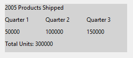
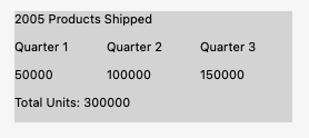
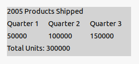
    <Label Grid.ColumnSpan="3" Grid.Row="0" Text="2021 Products Shipped" IsBold="True"/>
    <Label Grid.Row="1" Grid.Column="0" Text="Quarter 1" MinWidth="100"/>
    <Label Grid.Row="1" Grid.Column="1" Text="Quarter 2" MinWidth="100"/>
    <Label Grid.Row="1" Grid.Column="2" Text="Quarter 3" MinWidth="100"/>
    <Label Grid.Row="2" Grid.Column="0" Text="50000"/>
    <Label Grid.Row="2" Grid.Column="1" Text="100000"/>
    <Label Grid.Row="2" Grid.Column="2" Text="150000"/>
    <Label Grid.ColumnSpan="3" Grid.Row="3" Text="Total Units: 300000"/>
  </Grid>
</Border>
And the corresponding event handler in the code-behind:
Also, a Grid can be created from code:
var Grid = new Alternet.UI.Grid();
Grid.RowDefinitions.Add(new Alternet.UI.RowDefinition { Height = new Alternet.UI.GridLength(1, Alternet.UI.GridUnitType.Star) });
Grid.RowDefinitions.Add(new Alternet.UI.RowDefinition { Height = new Alternet.UI.GridLength(1, Alternet.UI.GridUnitType.Auto) });
var bt1 = new Button { Text = "First button" };
var bt2 = new Button { Text = "Second button" };
Alternet.UI.Grid.SetRow(bt1, 0);
Alternet.UI.Grid.SetRow(bt2, 1);
Grid.Children.Add(bt1);
Grid.Children.Add(bt2);
Remarks
A Grid contains a collection of Control objects, which are in the Children property.
Child controls of a Grid are drawn in the order in which they appear in UIXML or code. As a consequence, layered order (also known as z-order) can be achieved when controls share the same coordinates.
Child controls of a Grid can be absolutely positioned relative to the upper-left corner of their "cell" boundaries.
Examples of how a Grid can look on different platforms:
Constructors
- Grid(AbstractControl)
Initializes a new instance of the Grid class.
Fields
- ShowDebugCorners
Gets or sets whether to show debug corners when control is painted.
Properties
- ColumnCount
Gets or sets count of ColumnDefinitions.
- ColumnDefinitions
Gets a GridColumnCollection defined on this instance of Grid.
- ControlKind
Returns control identifier.
- LogicalChildrenCollection
Returns a collection of elements which can be treated as "logical children" of this element.
- RowColumnCount
Gets or sets RowCount and ColumnCount in the single property call.
- RowCount
Gets or sets count of RowDefinitions.
- RowDefinitions
Gets a GridRowCollection defined on this instance of Grid.
Methods
- AddAutoColumn()
Adds ColumnDefinition instance with Width equal to Auto.
- AddAutoRow()
Adds RowDefinition instance with Height equal to Auto.
- AddStarColumn()
Adds ColumnDefinition instance with Width equal to Star.
- AddStarRow()
Adds RowDefinition instance with Height equal to Star.
- DefaultPaint(PaintEventArgs)
Default painting method of the UserControl and its descendants.
- DefaultPaintDebug(PaintEventArgs)
Provides default debug related painting behavior for the control when the application is compiled in debug mode.
- GetColumn(AbstractControl)
Gets a value that indicates which column child control within a Grid should appear in.
- GetColumnSpan(AbstractControl)
Gets a value that indicates the total number of columns that child content spans within a Grid.
- GetPreferredSize(PreferredSizeContext)
Retrieves the size of a rectangular area into which a control can be fitted, in device-independent units.
- GetRow(AbstractControl)
Gets a value that indicates which row child control within a Grid should appear in.
- GetRowSpan(AbstractControl)
Gets a value that indicates the total number of rows that child content spans within a Grid.
- OnCellChanged(EventArgs)
Called when the CellChanged event is raised.
- OnChildInserted(int, AbstractControl)
Called when a AbstractControl is inserted into the Children.
- OnChildRemoved(AbstractControl)
Called when a AbstractControl is removed from the Children collections.
- OnLayout()
Called when the control should reposition its child controls.
- SetColumn(AbstractControl, int)
Sets a value that indicates which column child control within a Grid should appear in.
- SetColumnSpan(AbstractControl, int)
Sets a value that indicates the total number of columns that child content spans within a Grid.
- SetRow(AbstractControl, int)
Sets a value that indicates which row child control within a Grid should appear in.
- SetRowColumn(AbstractControl, int, int)
Sets a value that indicates which row and column child control within a Grid should appear in.
- SetRowSpan(AbstractControl, int)
Sets a value that indicates the total number of rows that child content spans within a Grid.
- Setup(AbstractControl[,])
Initializes Grid rows and columns for the specified controls.


