Class Button
Represents a button control.
[ControlCategory("Common")]
public class Button : ButtonBase, IBaseObjectWithAttr, IBaseObjectWithId, INotifyPropertyChanged, IDisposableObject, IBaseObject, ISupportInitialize, IFocusable, ITextProperty, IComponent, IControl, IDisposable, IWin32Window, ILayoutItem, INotifyDataErrorInfo, ICommandSource, IControlStateObjectChanged- Inheritance
-
Button
- Implements
Examples
Here is how to declare a Button in UIXML:
<Button Name="executeButton" Text="Execute" Click="ExecuteButton_Click" Margin="10"/>
And the corresponding event handler in the code-behind:
private void ExecuteButton_Click(object? sender, System.EventArgs e)
{
    MessageBox.Show("Hello", "Message");
}
Also, a button can be created from code:
var button = new Button
{
    Text = "Hello, world!",
    HorizontalAlignment = HorizontalAlignment.Left,
};
button.Click += ExecuteButton_Click;
Remarks
A button is one of the most commonly used UI controls. It is designed to mimic a real-world push button. When the user clicks on a button, the Click event is raised. This event is then handled to execute some code in response to the user clicking a button.
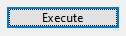
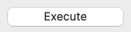
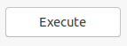
Examples of how a button can look on different platforms:
Set Text property to specify the text displayed on the control.
A button, like any other Control, can be disabled by setting its Enabled property to false.
Constructors
- Button(AbstractControl)
Initializes a new instance of the Button class with the specified parent control.
- Button(Control, string, Action?)
Initializes a new instance of the Button class with the specified text, click action and parent control.
- Button(string)
Initializes a new Button instance with the specified text.
- Button(string, Action)
Initializes a new instance of the Button class with the specified text and click action.
Properties
- ControlKind
Returns control identifier.
- DisabledImage
Gets or sets an Image for disabled control state.
- ExactFit
Gets or sets whether buttons are made of at least the standard button size, even if their contents is small enough to fit into a smaller size.
- FocusedImage
Gets or sets an Image for focused control state.
- HasBorder
Gets or sets a value indicating whether the control has a border.
- HoveredImage
Gets or sets an Image for hovered control state.
- Image
Gets or sets the image that is displayed on a button control.
- ImagesEnabled
Gets or sets whether images in buttons are available.
- IsCancel
Gets or sets a value that indicates whether a Button is a 'Cancel' button. In a modal dialog, a user can activate the 'Cancel' button by pressing the ESC key.
- IsDefault
Gets or sets a value that indicates whether a Button is the default button. In a modal dialog, a user invokes the default button by pressing the ENTER key.
- IsGeneric
Determines whether the current instance represents a generic button type rather than a platform-specific implementation.
- PressedImage
Gets or sets an Image for pressed control state.
- StateImages
Specifies a set of images for different Button states.
- TextAlign
Sets the position at which the text is displayed.
- TextVisible
Gets or sets visibility of the text in the bitmap.
- UseVisualStyleBackColor
Gets or sets a value that determines if the background is drawn using visual styles, if supported.
Methods
- CreateHandler()
Creates a handler for the control.
- GetPreferredSize(PreferredSizeContext)
Retrieves the size of a rectangular area into which a control can be fitted, in device-independent units.
- OnMouseLeftButtonUp(MouseEventArgs)
Called when the left mouse button was released.
- OnPaint(PaintEventArgs)
Called when the control is redrawn. See Paint for details.
- OnSizeChanged(EventArgs)
Called when the SizeChanged event.
- OnSystemColorsChanged(EventArgs)
Called when the SystemColorsChanged event is raised.
- OnTextChanged(EventArgs)
Called when the TextChanged event is raised.
- OnVisualStateChanged(EventArgs)
Called when VisualStateChanged property is changed.
- SetImageMargins(float, float?)
Sets the margins between the image and the text of the button. Value is in device-independent units.
- SetImagePosition(ElementContentAlign)
Sets the position at which the image is displayed.
- ShowDropDownMenu()
Shows attached drop down menu.