Class TabControl
Represents a control that manages a related set of tab pages.
[ControlCategory("Containers")]
public class TabControl : HiddenBorder, IBaseObjectWithAttr, IBaseObjectWithId, INotifyPropertyChanged, IDisposableObject, IBaseObject, ISupportInitialize, IFocusable, ITextProperty, IComponent, IControl, IDisposable, IWin32Window, ILayoutItem, INotifyDataErrorInfo- Inheritance
-
TabControl
- Implements
- Derived
Examples
Here is how to declare a TabControl in UIXML:
<TabControl SuggestedHeight="150" Name="tabControl" Margin="10">
  <TabPage Title="Page 1"></TabPage>
  <TabPage Title="Page 2"></TabPage>
  <TabPage Title="Page 3"></TabPage>
  <TabPage Title="Page 4"></TabPage>
  <TabPage Title="Page 5"></TabPage>
</TabControl>
Also, a TabControl can be created from code:
var tc = new Alternet.UI.TabControl();
tc.SuggestedHeight = 300;
tc.Margin = 10;

var page1 = new TabPage
{
    Title = "Page 1",
};

var content1 = new StdListBox
{
    HasBorder = false,
    Items = new string[] { "Item 1", "Item 2", "Item 3", "Item 4", "Item 5" },
};

content1.Parent = page1;

tc.Pages.Add(page1);
tc.Pages.Add(new TabPage { Title = "Page 2" });
tc.Pages.Add(new TabPage { Title = "Page 3" });
tc.Pages.Add(new TabPage { Title = "Page 4" });
tc.Pages.Add(new TabPage { Title = "Page 5" });
tc.Parent = mainPanel;

tc.SelectedPageChanged += (s, e) =>
{
    Title = $"Selected page: {tc.SelectedPage?.Title}";
};
Remarks
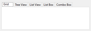
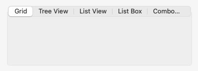
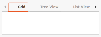
Examples of how a TabControl can look on different platforms:
Constructors
- TabControl()
Initializes a new instance of the TabControl class.
- TabControl(Control)
Initializes a new instance of the TabControl class.
Fields
- DefaultLargeSvgSize
Gets or sets default svg size for high-dpi displays used in SetTabSvg(int?, SvgImage?, int?, Color?).
- DefaultMinTabSize
Gets or sets default minimal tab size in the header.
- DefaultSmallSvgSize
Gets or sets default svg size for normal-dpi displays used in SetTabSvg(int?, SvgImage?, int?, Color?).
Properties
- Appearance
Gets or sets the visual appearance of the control's tabs.
- CloseButton
Gets the button with X image that is shown in the header and can be configured to close (or hide) tab page (or tab control itself).
- ContentElements
Returns a collection of content elements which is used by the UIXML loader to find content items by index.
- ContentPadding
Gets or sets padding of contents.
- ContentVisible
Gets or sets whether contents of the control is visible. If contents is hidden only tab headers are shown.
- ContentsControl
Gets inner content control with tab pages.
- ControlKind
Returns control identifier.
- DisplayRectangle
Gets the display area of the control's tab pages.
- HasCloseButton
Gets or sets a value indicating whether the header includes a close button.
- HasInteriorBorder
Gets or sets whether tab interior border is visible.
- HeaderButtons
Gets an enumerable collection of header buttons associated with the tabs in the control.
- HeaderButtonsCount
Gets the count of header buttons based on the number of tabs in the header.
- HeaderControl
Gets inner header control with tab labels.
- ImageToText
Gets or sets the layout relationship between the image and text content within the tab (vertical or horizontal align).
- IsVertical
Gets or sets how the tabs and content are aligned.
- IsVerticalText
Gets or sets a value indicating whether the text should be rendered vertically.
- LoadedPages
Gets the collection of the loaded pages.
- Padding
Gets or sets the padding inside a control.
- Pages
Gets the collection of tab pages in this tab control.
- SelectedControl
Gets selected tab page.
- SelectedIndex
Gets or sets the index of the currently selected tab page.
- SelectedPage
Gets or sets the currently selected tab page.
- SizeMode
Gets or sets the way that the control's tabs are sized.
- TabAlignment
Gets or sets the area of the control (for example, along the top) where the tabs are aligned.
- TabCount
Gets the number of tabs in the tab strip.
- TabPaintAlignment
Gets or sets alignment override used when tabs are painted.
- TabTheme
Gets or sets colors and styles theme of the tabs.
- TabsVisible
Gets or sets whether tab titles are visible.
Methods
- Add(AbstractControl)
Adds new page.
- Add(NameValue<AbstractControl>)
Adds new page.
- Add(NameValue<Func<AbstractControl>>)
Adds new page.
- Add(string?, AbstractControl?)
Adds new page.
- Add(string, Func<AbstractControl>)
Adds new page.
- AddRange(IEnumerable<NameValue<AbstractControl>>)
Adds new pages.
- AddRange(IEnumerable<NameValue<Func<AbstractControl>>?>)
Adds new pages.
- DrawTabHeaderInterior(CardPanelHeader, Graphics, RectD, Brush, TabAlignment)
Draws tab header interior.
- DrawTabHeaderItemsInterior(Graphics, RectD, RectD, Brush, TabAlignment, int, int)
Draws tab header items interior.
- EnsureChild<T>(string?, Action<T>?, Action<T>?, EnsureSideBarChildFlags)
Ensures that a child control of the specified type exists within one of the tabs.
- GetControlAt(int?)
Gets tab page at the specified index.
- GetDefaultInteriorBorderColor()
Gets default interior border color as light/dark color pair.
- GetHeaderButton(AbstractControl?)
Retrieves the header button associated with the specified tab page.
- GetHeaderButtonAt(int?)
Retrieves the header button associated with the specified tab index.
- GetInteriorBorderColor()
Gets interior border color.
- GetTabIndex(AbstractControl?)
Gets index of the tab page or
nullif control is not found in tabs.
- GetTitle(int?)
Gets title of the specified tab page.
- Insert(int?, AbstractControl)
Inserts new page at the specified index.
- Insert(int?, string?, AbstractControl?)
Inserts new page at the specified index.
- OnCardPanelHeaderBeforeTabClick(object?, BaseCancelEventArgs)
Called before a tab header is clicked.
- OnCardPanelHeaderButtonSizeChanged(object?, BaseEventArgs<AbstractControl>)
Called when the size of the header button changes.
- OnCardPanelHeaderTabClick(object?, EventArgs)
Called when a tab header is clicked.
- OnChildPropertyChanged(AbstractControl, string, bool)
Called by the child control when its property is changed.
- OnHeaderPaint(object?, PaintEventArgs)
Called when the header is painted.
- OnPagesItemInserted(object?, int, AbstractControl)
Called when item is inserted into the pages collection.
- OnPagesItemRemoved(object?, int, AbstractControl)
Called when item is removed from the pages collection.
- OnPaint(PaintEventArgs)
Called when the control is redrawn. See Paint for details.
- OnSizeChanged(EventArgs)
Called when the SizeChanged event.
- RaiseSelectedIndexChanged()
Raises the SelectedIndexChanged and SelectedPageChanged events and updates the minimum size of the control based on the current settings.
- Remove(AbstractControl)
Removes tab page from the control.
- RemoveAll()
Removed all items from the control.
- RemoveAt(int?)
Removes tab page with the specified index.
- ResetTabImage(int?)
Resets images for the tab.
- SelectFirstTab()
Selects the first tab if it exists.
- SelectTab(int?)
Selects tab with the specified index.
- SetTabImage(int?, Image?, Image?)
Sets images for the tab.
- SetTabImage(int?, ImageSet?, ImageSet?)
Sets images for the tab.
- SetTabSvg(int?, SvgImage?, int?, Color?)
Sets svg image for the tab.
- SetTitle(int?, string?)
Sets title of the specified tab page.
Events
- CloseButtonClick
Occurs when the close button is clicked.
- SelectedIndexChanged
Occurs when the SelectedIndex property has changed.
- SelectedPageChanged
Occurs when the selected page has changed.
- TabSizeChanged
Occurs when the size of the tab has changed.