Class ComboBox
Represents a combo box control.
[ControlCategory("Common")]
public class ComboBox : Control, IBaseObjectWithAttr, IBaseObjectWithId, INotifyPropertyChanged, IDisposableObject, IBaseObject, ISupportInitialize, IFocusable, ITextProperty, IComponent, INotifyDataErrorInfo, IListControl, IListControlItemContainer, IReadOnlyStrings, IListControl<object>, IControl, IDisposable, IWin32Window, ILayoutItem- Inheritance
-
ComboBox
- Implements
- Derived
Examples
Here is how to declare a ComboBox in UIXML:
<ComboBox Name="comboBox" Margin="8" IsEditable="false" VerticalAlignment="Top" HorizontalAlignment="Left"
          SelectedItemChanged="ComboBox_SelectedItemChanged" TextChanged="ComboBox_TextChanged" />
And the corresponding event handler in the code-behind:
private void ComboBox_TextChanged(object? sender, EventArgs e)
{
    var text = comboBox.Text == "" ? "\"\"" : comboBox.Text;
    App.Log(text);
}

private void ComboBox_SelectedItemChanged(object? sender, EventArgs e)
{
    App.Log($"Selected Item Text: {comboBox.SelectedItem}" + "\n" +
                    $"Index: {comboBox.SelectedIndex}");
}
Also, a ComboBox can be created from code:
var comboBox = new Alternet.UI.ComboBox();
comboBox.Items.Add("One");
comboBox.Items.Add("Two");
comboBox.Items.Add("Three");
comboBox.SelectedIndex = 1;
comboBox.SelectedItemChanged += ComboBox_SelectedItemChanged;
Remarks
A ComboBox displays a text box combined with a ListBox, which enables the user to select items from the list or enter a new value. The IsEditable property specifies whether the text portion can be edited.
To add or remove objects in the list at run time, use methods of the object returned by the Items property of the ComboBox. The list then displays the default string value for each object. You can add individual objects with the Add method of the Items object. You can delete items with the Remove method or clear the entire list with the Clear method.
In addition to display and selection functionality, the ComboBox also provides features that enable you to add items to the ComboBox and to find text within the items of the list. With the BeginUpdate() and EndUpdate() methods, you can add a large number of items to the ComboBox without the control being repainted each time an item is added to the list.
You can use the Text property to specify the string displayed in the editing field, the SelectedIndex property to get or set the current item, and the SelectedItem property to get or set a reference to the selected object.
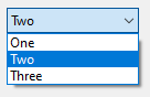
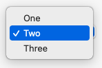
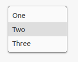
Examples of how a ComboBox can look on different platforms:
Set Text property to specify the text displayed on the control.
A ComboBox, like any other Control, can be disabled by setting
its Enabled property to false.
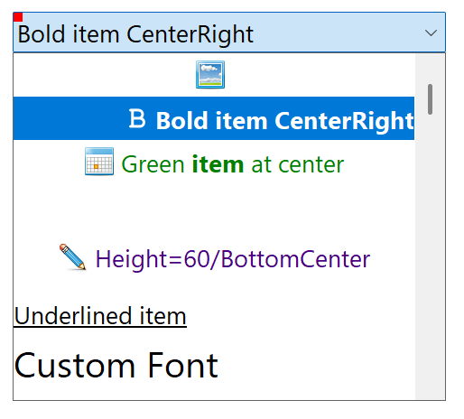
A ComboBox can have owner-draw and styled items with custom colors, font, border and image. Use ListControlItem as an item of a ComboBox in order to have the ability to customize style and behavior options.
Constructors
- ComboBox()
Initializes a new instance of the ComboBox class.
- ComboBox(AbstractControl)
Initializes a new instance of the ComboBox class.
Fields
- DefaultDisabledTextColor
Gets or sets default disabled text color.
- DefaultImageBorderColor
Gets or sets default color of the image border.
- DefaultImageTextDistance
Gets or sets default distance between image and text in the item.
- DefaultImageVerticalOffset
Gets or sets default vertical offset of the item's image for the items with images.
Properties
- AllowMouseWheel
Gets or sets a value indicating whether the mouse wheel can be used to change the selected item.
- ControlKind
Returns control identifier.
- Count
Gets the number of items contained in the control.
- DrawMode
Gets or sets a value indicating whether your code or the operating system will handle drawing of elements in the list.
- DropDownStyle
Gets or sets a value specifying the style of the combo box.
- DroppedDown
Gets a value indicating whether the combo box is displaying its drop-down portion.
- EmptyTextHint
Gets or sets a hint shown in an empty unfocused text control.
- FirstItem
Gets first item in the control or
nullif there are no items.
- FormatProvider
Gets or sets format provider used to get text representation of the item for the display and other purposes. Default is
null. If not specified, CurrentCulture is used.
- HasBorder
Gets or sets a value indicating whether the control has a border.
- IsEditable
Gets or a value that enables or disables editing of the text in text box area of the ComboBox.
- this[int]
Gets or sets the element at the specified index.
- this[long]
Gets or sets the Items element at the specified index.
- this[int?]
Gets the element at the specified index.
- ItemPainter
Gets or sets item painter associated with the control.
- Items
Gets or sets the items of the control.
- LastItem
Gets last item in the control or
nullif there are no items.
- LastRootItem
Gets last root item in the control or
nullif there are no items.
- OwnerDrawItem
Gets or sets whether item is owner drawn.
- OwnerDrawItemBackground
Gets or sets whether background of the item is owner drawn.
- OwnerDrawItemDefaults
Gets or sets defaults which are used when items are painted in the popup list box in the case when item is ListControlItem and owner draw mode is turned on.
- Search
Gets or sets string search provider.
- SelectedAction
Returns Action associated with the SelectedItem if it is ListControlItem.
- SelectedIndex
Gets or sets the index specifying the currently selected item.
- SelectedIndexAsInt
Gets or sets the zero-based index of the currently selected item in the control. Same as SelectedIndex but is not nullable.
- SelectedItem
Gets or sets currently selected item in the combo box.
- SelectedUniqueId
Returns ObjectUniqueId associated with the SelectedItem if it is ListControlItem.
- TextMargin
Gets text margin. It is the empty space between borders of control and the text itself.
- TextSelectionLength
Gets the number of characters selected in the editable portion of the combo box.
- TextSelectionStart
Gets the starting index of text selected in the combo box.
Methods
- Add(object)
Adds an object to the end of the Items collection.
- Add(string, Action)
Adds
textwithactionto the end of the items collection.
- Add(string, object?)
Adds
textwithdatato the end of the items collection.
- AddEnumValues(Type, object?)
Adds enum values to the items collection.
- AddEnumValues<T>()
Adds enum values to the items collection.
- AddEnumValues<T>(T)
Adds enum values to items collection.
- AttachItems(BaseCollection<object>?)
Called when items are attached to the control.
- BindEnumProp(object, string, Func<object, bool>?)
Binds property specified with
instanceandpropNameto the ComboBox. After binding ComboBox will edit the specified property.
- ClearSelected()
Unselects all items in the control.
- CreateHandler()
Creates a handler for the control.
- DefaultItemPaint(ComboBoxItemPaintEventArgs)
Default item paint method.
- DetachItems(BaseCollection<object>?)
Called when items are detached to the control.
- FindString(string?)
Returns the index of the first item in the control that starts with the specified string.
- FindString(string?, int?)
Returns the index of the first item in the control beyond the specified index that contains the specified string. The search is not case sensitive.
- FindStringEx(string?, int?, bool, bool)
Returns the index of the first item in the control beyond the specified index that contains or equal the specified string.
- FindStringExact(string?)
Finds the first item in the combo box that matches the specified string.
- GetBestSizeWithoutPadding(PreferredSizeContext)
Gets size of the native control without padding.
- GetDisabledTextColor()
Gets text color when control is disabled.
- GetItem(int)
Gets item with the specified index. This methods is called from all other methods that request the item.
- GetItemImageRect(ComboBoxItemPaintEventArgs)
Gets suggested rectangles of the item's image and text.
- GetItemText(int, bool)
Returns the text representation of item with the specified
index.
- GetItemText(object?, bool)
Returns the text representation of the specified item.
- InvalidateBestSize()
Resets the cached best size value so it will be recalculated the next time it is needed.
- ItemsAsText(IReadOnlyList<int>, string?)
Gets items as string.
- ItemsCollectionChanged(object?, NotifyCollectionChangedEventArgs)
Callback which is called when items are changed in the control.
- OnDropDown(EventArgs)
Called when the DropDown event is fired.
- OnDropDownClosed(EventArgs)
Called when the DropDownClosed event is fired.
- OnHandleCreated(EventArgs)
Called when the control's handle is created.
- OnSelectedItemChanged(EventArgs)
Called when the value of the SelectedItem property changes.
- PerformLayout(bool)
Forces the control to apply layout logic to child controls.
- RaiseDropDown()
Raises the DropDown event and calls OnDropDown(EventArgs) method.
- RaiseDropDownClosed()
Raises the DropDownClosed event and calls OnDropDownClosed(EventArgs) method.
- RaiseFontChanged(EventArgs)
Raises the FontChanged event and calls OnFontChanged(EventArgs) method.
- RaiseSelectedItemChanged()
Raises the SelectedItemChanged event and calls OnSelectedItemChanged(EventArgs).
- RecreateItems(BaseCollection<object>?)
Recreates items. Before calling this method, you need to unbind all events connected to the Items.
- RemoveAll()
Removes all items from the control.
- RemoveItemWithValue(object?)
Removes item with the specified value. Item is removed if it equals the specified value or if it is ListControlItem and it's Value property equals the value.
- RemoveItemWithValueIf(object?, bool)
Same as RemoveItemWithValue(object?), but checks for the condition before removing the item.
- RemoveItems(IReadOnlyList<int>)
Removes items from the control.
- RequiredItem(int)
Gets ListControlItem item with the specified index. If index of the item is invalid, an exception is thrown.
- RequiredItem<T>(int)
Gets item with the specified index. If index of the item is invalid, throws an exception.
- SafeItem(int)
Gets ListControlItem item with the specified index. If index of the item is invalid or item is not ListControlItem, returns
null.
- SafeItem<T>(int)
Gets item with the specified index. If index of the item is invalid, returns null.
- SafeItems()
Gets items.
- SelectAllText()
Selects all the text in the editable portion of the ComboBox.
- SelectFirstItem()
Selects first item in the control.
- SelectLastItem()
Selects last item in the control.
- SelectTextRange(int, int)
Selects a range of text in the editable portion of the ComboBox.
- SelectedItemAs<T>()
Casts selected item to
Ttype.
- SetCount(int, Func<object>)
Changes the number of elements in the Items.
- SetItem(int, object)
Sets item with the specified index. This methods is called from all other methods that change the item.
- SetSelectedIndex(int?)
Sets SelectedIndex. Implemented as method for the convenience.
- ShouldPaintHintText()
Gets whether hint text should be painted.
Events
- CustomItemText
Occurs when controls needs to get string representation of the item for the display or other purposes. Called from GetItemText(int, bool).
- DropDown
Occurs when the drop-down portion of the control is shown.
- DropDownClosed
Occurs when the drop-down portion of the control is no longer visible.
- IsEditableChanged
Occurs when the IsEditable property value changes.
- SelectedIndexChanged
Same as SelectedItemChanged. Added for the compatibility.
- SelectedItemChanged
Occurs when the SelectedItem property value changes.