Class TreeView
Displays a hierarchical collection of labeled items with optional images, each represented by a TreeViewItem. This control encapsulates the native tree view implemented by the operating system. It has limited functionality. For the full featured tree view control, use the StdTreeView control. StdTreeView supports all capabilities specified in TreeViewItem properties and works much faster, especially with large number of items.
[ControlCategory("Common")]
public class TreeView : Control, IBaseObjectWithAttr, IBaseObjectWithId, INotifyPropertyChanged, IDisposableObject, IBaseObject, ISupportInitialize, IFocusable, ITextProperty, IComponent, IControl, IDisposable, IWin32Window, ILayoutItem, INotifyDataErrorInfo, ITreeViewItemContainer, IListControlItemContainer- Inheritance
-
TreeView
- Implements
Examples
Here is how to declare a TreeView in UIXML:
<TreeView SuggestedWidth="300" SuggestedHeight="240" Name="treeView"
          SelectionChanged="TreeView_SelectionChanged"
          ExpandedChanged="TreeView_ExpandedChanged" />
And the corresponding event handler in the code-behind:
private void TreeView_SelectionChanged(object? sender, EventArgs e)
{
    App.Log($"TreeView: SelectionChanged. SelectedItem: {treeView.SelectedItem?.Text}");
}

private void TreeView_ExpandedChanged(object? sender, TreeViewEventArgs e)
{
    App.Log($"TreeView: ExpandedChanged. Item: {e.Item.Text} {e.Item.IsExpanded}");
}
Also, a TreeView can be created from code:
static void AddItems(TreeView treeView, int count)
{
    var r = new Random();

    int start = treeView.Items.Count + 1;

    treeView.BeginUpdate();
    try
    {
        for (int i = start; i < start + count; i++)
        {
            int imageIndex = r.Next(4);
            var item = new TreeViewItem("Item " + i)
            {
                ImageIndex = imageIndex,
            };
            for (int j = 0; j < 3; j++)
                item.Add(new TreeViewItem(item.Text + "." + j, r.Next(4)));
            treeView.Add(item);
        }
    }
    finally
    {
        treeView.EndUpdate();
    }
}

public Alternet.UI.TreeView CreateTreeView()
{
    var result = new Alternet.UI.TreeView();
    AddItems(result, 10);
    return result;
}
Remarks
The Items collection holds all the TreeViewItem objects that are assigned to the TreeView control. The items in this collection are referred to as root items. Any item that is subsequently added to a root item is referred to as a child node. Each TreeViewItem can contain a collection of other TreeViewItem objects.
You can display images next to the tree nodes by assigning an ImageList to the ImageList property and referencing the index value of an Image in the ImageList to assign that Image. Set the ImageIndex property to the index value of the Image that you want to display for all items by default. Individual items can override the default images by setting the ImageIndex property.
TreeView items can be expanded to display the next level of child items. The user can expand the TreeViewItem by clicking the expand button if one is displayed next to the TreeViewItem, or you can expand the TreeViewItem by calling the Expand() method. To expand all the child item levels in the Items collection, call the ExpandAll() method. You can collapse the child TreeViewItem level by calling the Collapse() method, or the user can press the expand button, if one is displayed next to the TreeViewItem. You can also call the Toggle() method to alternate between the expanded and collapsed states.
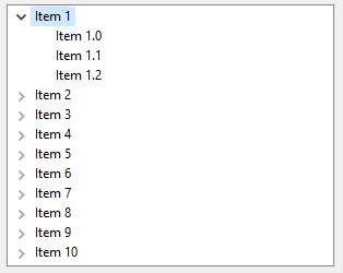
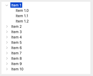
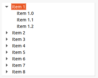
Examples of how a TreeView can look on different platforms:
Constructors
- TreeView()
Initializes a new instance of the TreeView class.
- TreeView(AbstractControl)
Initializes a new instance of the TreeView class.
Fields
- DefaultCreateStyleLinux
The set of flags that are closest to the defaults for the native control under Linux.
- DefaultCreateStyleMacOs
The set of flags that are closest to the defaults for the native control under MacOs.
- DefaultCreateStyleWin
The set of flags that are closest to the defaults for the native control under Windows.
Properties
- AllowLabelEdit
Gets or sets a value indicating whether the label text of the tree items can be edited.
- ControlKind
Returns control identifier.
- EventsSuspended
Gets a value indicating whether events are currently suspended.
- FirstItem
Gets first root item in the control or
nullif there are no items.
- FormatProvider
Gets or sets format provider used to get text representation of the item for the display and other purposes. Default is
null. If not specified, CurrentCulture is used.
- FullRowSelect
Gets or sets a value indicating whether the selection highlight spans the width of the tree view control.
- HasBorder
Gets or sets a value indicating whether the control has a border.
- HideRoot
Gets or sets a value indicating whether the display of the root node is suppressed. This effectively causing the first-level nodes to appear as a series of root nodes.
- ImageIndex
Gets or sets the index of the image that is displayed for the items in this TreeView by default.
- Indentation
Gets or sets the current control indentation.
- Items
Gets a collection containing all the root items in the control.
- LastItem
Gets last item in the control or
nullif there are no items.
- LastRootItem
Gets last root item in the control or
nullif there are no items.
- RootItem
Gets the root item of the tree view.
- RowLines
Gets or sets a value indicating whether to draw a contrasting border between displayed rows.
- SelectedItem
Gets or sets the currently selected item in the TreeView.
- SelectedItems
Gets a collection containing the currently selected items in the TreeView.
- SelectionMode
Gets or sets the method in which items are selected in the TreeView.
- ShowExpandButtons
Gets or sets a value indicating whether expand buttons are displayed next to tree items that contain child tree items.
- ShowLines
Gets or sets a value indicating whether lines are drawn between tree items in the tree view control.
- ShowRootLines
Gets or sets a value indicating whether lines are drawn between the tree items that are at the root of the tree view.
- StateImageSpacing
Gets or sets the number of horizontal pixels between the buttons and the state images.
- TopItem
Gets or sets the first fully-visible tree item in the tree view control.
- TwistButtons
Gets or sets a value indicating whether to select alternative style of +/- buttons and to show rotating ("twisting") arrows instead.
- VariableRowHeight
Gets or sets a value indicating whether row heights become big enough to fit the content.
Methods
- Add(TreeViewItem)
Adds an object to the end of the Items collection.
- BeginLabelEdit(TreeViewItem?)
Begins editing the label text of the specified tree view item.
- ClearSelected()
Unselects all items in the TreeView.
- CollapseAll()
Collapses all child tree items.
- CreateHandler()
Creates a handler for the control.
- EndLabelEdit(TreeViewItem?, bool)
Ends the label editing process for the specified TreeViewItem.
- EnsureVisible(TreeViewItem?)
Ensures that the tree item is visible, expanding tree items and scrolling the tree view control as necessary.
- ExpandAll()
Expands all child tree items.
- GetNodeAt(PointD)
Retrieves the tree view item that is at the specified point.
- GetNodeAtMouseCursor()
Gets tree view item at the current cursor position.
- HitTest(PointD)
Provides tree view item information, at a given client point, in device-independent units.
- HitTestLocation(PointD)
Gets TreeViewHitTestLocations at a given client point, in device-independent units.
- MakeAsListBox()
Changes visual style of the control to look like StdListBox.
- OnAfterCollapse(TreeViewEventArgs)
Called after a tree item is collapsed.
- OnAfterExpand(TreeViewEventArgs)
Called after a tree item is expanded.
- OnAfterLabelEdit(TreeViewEditEventArgs)
Called after a tree item label is edited.
- OnBeforeCollapse(TreeViewCancelEventArgs)
Called before a tree item is collapsed.
- OnBeforeExpand(TreeViewCancelEventArgs)
Called before a tree item is expanded.
- OnBeforeLabelEdit(TreeViewEditEventArgs)
Called before a tree item label is edited.
- OnExpandedChanged(TreeViewEventArgs)
Called after IsExpanded property value of a tree item belonging to this TreeView changes.
- OnHandleCreated(EventArgs)
Called when the control's handle is created.
- OnItemAdded(TreeViewEventArgs)
Called when an item is added to this TreeView control, at any nesting level.
- OnItemRemoved(TreeViewEventArgs)
Called when an item is removed from this TreeView control, at any nesting level.
- OnSelectionChanged(EventArgs)
Called when the SelectedItem property or the SelectedItems collection has changed.
- RaiseAfterCollapse(TreeViewEventArgs)
Raises the AfterCollapse event and calls OnAfterCollapse(TreeViewEventArgs).
- RaiseAfterExpand(TreeViewEventArgs)
Raises the AfterExpand event and calls OnAfterExpand(TreeViewEventArgs).
- RaiseAfterLabelEdit(TreeViewEditEventArgs)
Raises the AfterLabelEdit event and calls OnAfterLabelEdit(TreeViewEditEventArgs).
- RaiseBeforeCollapse(TreeViewCancelEventArgs)
Raises the BeforeCollapse event and calls OnBeforeCollapse(TreeViewCancelEventArgs).
- RaiseBeforeExpand(TreeViewCancelEventArgs)
Raises the BeforeExpand event and calls OnBeforeExpand(TreeViewCancelEventArgs).
- RaiseBeforeLabelEdit(TreeViewEditEventArgs)
Raises the BeforeLabelEdit event and calls OnBeforeLabelEdit(TreeViewEditEventArgs).
- RaiseExpandedChanged(TreeViewEventArgs)
Raises the ExpandedChanged event and calls OnExpandedChanged(TreeViewEventArgs).
- RaiseSelectionChanged(EventArgs)
Raises the SelectionChanged event and calls OnSelectionChanged(EventArgs).
- RemoveAll()
Removed all items from the control.
- RemoveItemAndSelectSibling(TreeViewItem?)
Removes item and selects its sibling (next or previous on the same level).
- RemoveSelected()
Removes selected items from the control.
- ResumeEvents()
Resumes the processing of events by decrementing the suspension counter.
- ScrollIntoView(TreeViewItem?)
Scrolls the specified item into view.
- SelectAndShowItem(TreeViewItem?)
Selects and shows specified item in the control.
- SelectFirstItem()
Selects first item in the control.
- SetSelected(TreeViewItem, bool)
Selects or clears the selection for the specified item in a TreeView.
- SetSelectedIndex(int?)
Sets SelectedItem to the item on the root level with the specified index.
- SuspendEvents()
Temporarily suspends the raising of events.
Events
- AfterCollapse
Occurs after the tree item is collapsed.
- AfterExpand
Occurs after the tree item is expanded.
- AfterLabelEdit
Occurs after the tree item label text is edited. This event can be canceled.
- BeforeCollapse
Occurs before the tree item is collapsed. This event can be canceled.
- BeforeExpand
Occurs before the tree item is expanded. This event can be canceled.
- BeforeLabelEdit
Occurs before the tree item label text is edited. This event can be canceled.
- ExpandedChanged
Occurs after IsExpanded property value of a tree item belonging to this TreeView changes.
- ImageListChanged
Occurs when the ImageList property value changes.
- ItemRemoved
Occurs when an item is removed from this TreeView control, at any nesting level.
- SelectionChanged
Occurs when the SelectedItem property or the SelectedItems collection has changed.
- SelectionModeChanged
Occurs when the value of the SelectionMode property changes.